Transforming banking homepage into a high-usage action hub
Simplifying banking tasks from 3 taps to 1 across a growing super app
Key Impact Metrics
74 NPS
Q3 2025, record-high
Up from 67 in Q3 2024 and 73 in Q2 2025
+67%
Role
Timeline
Team

The Challenge
Redesign the main banking app’s home for 1.5 million users with different levels of digital confidence — creating a balance between regulatory compliance, trust, and real user needs.
Bank of Georgia's app had a problem.
It started as a simple tool to move money around. Then features kept getting added — payments, investments, insurance, gift cards, travel cards, parking fines, lifestyle offers. Year after year, without a clear plan.
By the time we stepped back to look at it, the app had turned into a patchwork. 1.5 million people were using it daily. And a lot of them were frustrated.
User reviews made that clear. Navigation kept coming up in complaints. But I knew navigation wasn't the real problem — it was just the symptom. The real question was: what do users actually need, and how are the best banking apps in the world organising that?
Around the same time, at the 2022 Technology Day Update, Bank of Georgia announced its super app ambition — a shift from “banking tool” to “financial companion.” A single place for payments, investments, lifestyle, and more.
Discovery & Research
We consolidated three years of data and research insights from 6,200+ users across four key segments: parents, emigrants, investors, and general users.
Research Methods
20 users
Card sorting
5+ apps
Competitive Analyses
10+ users
Usability Testing
Deep Dive
Analytics Analyses
Usage
46% use app daily, 26% multiple times per day (Emigrants)
87% use app daily or multiple times per day (Investors)
88% use app daily, high monitoring activity (Parents)
Most varied, 77% use daily or several times per day (General Users)
Top requests
"Show currency exchange rates on homepage"
"Larger, more detailed investment widget"
"Easier access to children's transactions"
"Simpler, less cluttered design"
We ran research with 6,200+ users
We ran research with 6,200+ users.The most frequent tasks — checking balances (87%), transferring money (39%), and making payments (35%) — all required navigating through 2-3 screens.
Competitive Analyses
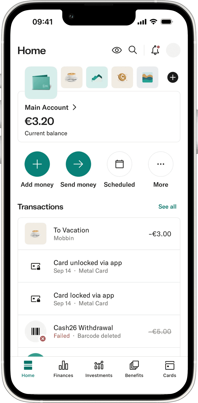
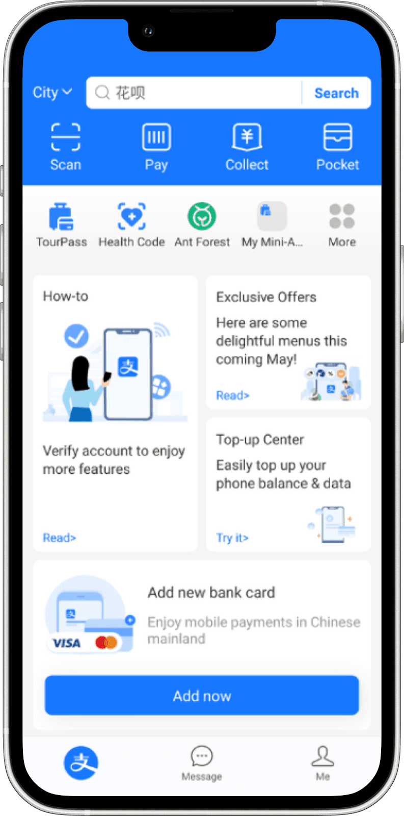
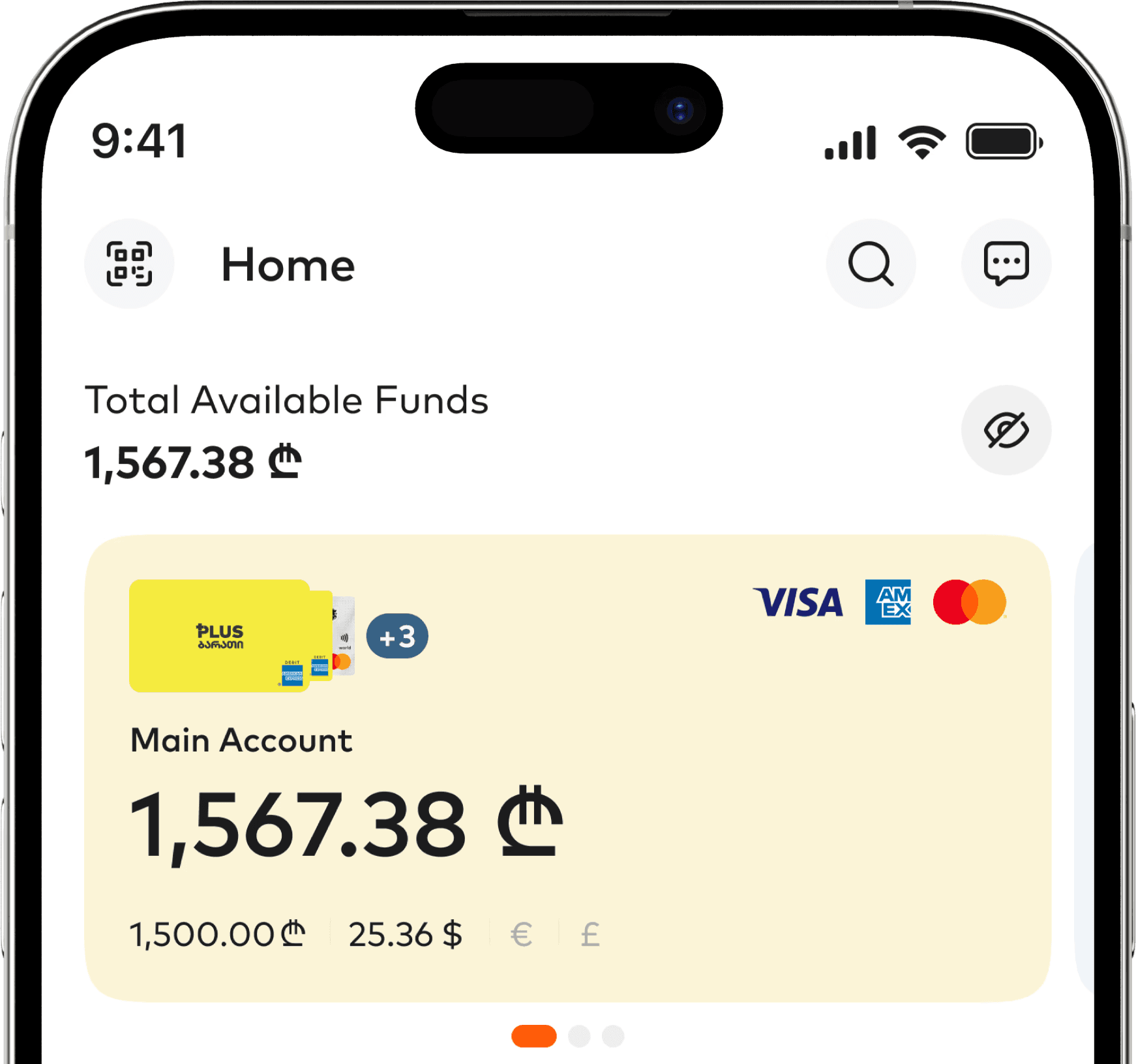
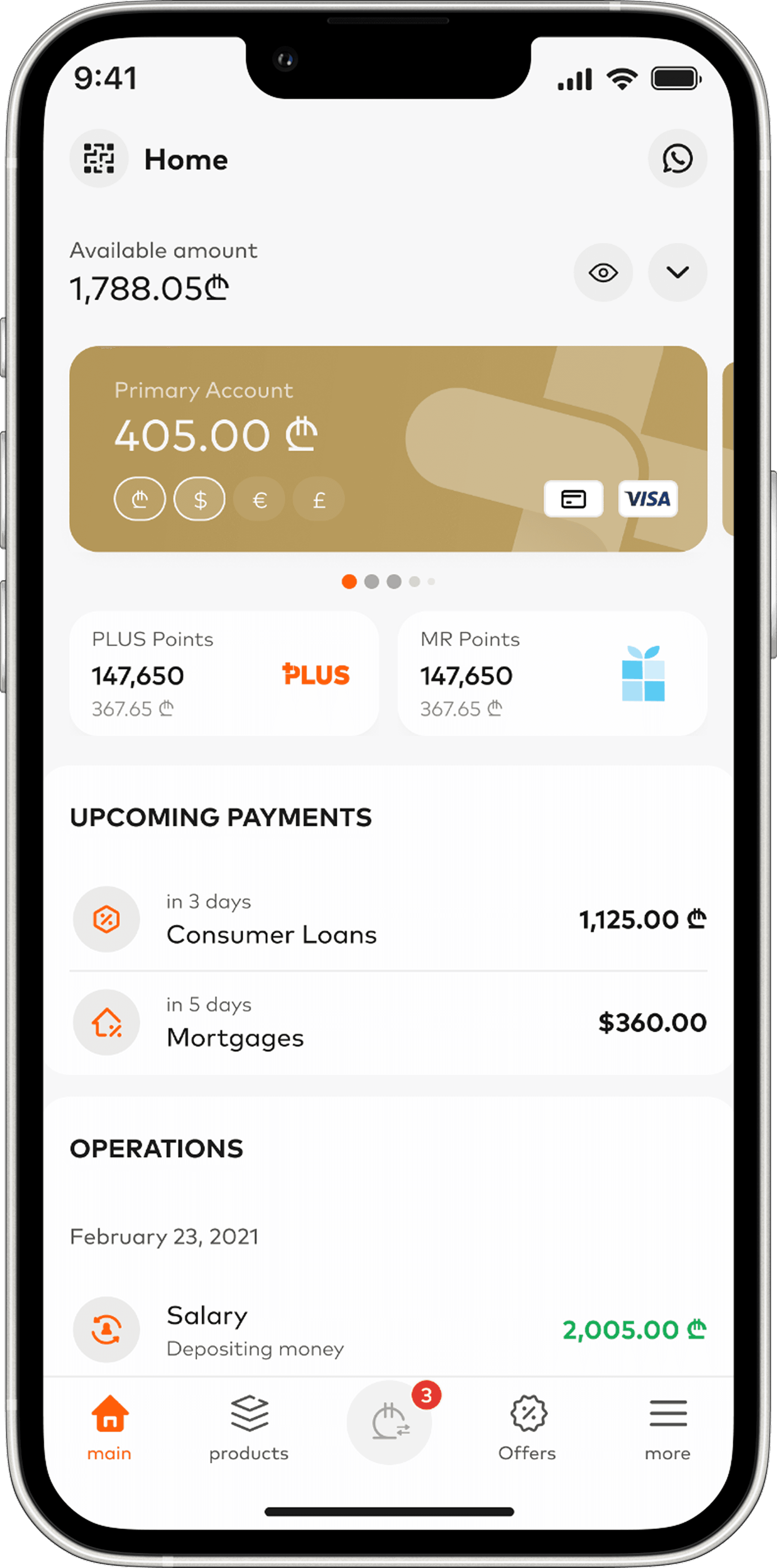
I also looked at Revolut, Wise, N26, Sber, Tinkoff and Alipay.
One pattern was consistent: all of them (except Wise) put actionable items front and center on the home screen.
Findings
87% of sessions started with checking a balance — but multi-currency breakdowns were buried behind multiple taps.
Findings
Primary actions needed 3+ taps to reach — Pay and Transfer were hidden in secondary screens. Researched apps keep these always visible.
Findings
59% of users didn't know certain features existed — the problem wasn't feature quality. It was discoverability.
Design Principles
Primary actions must live on the home page
Parents, emigrants, investors and general users should be able to make financial transactions with one tap.
Financial state should be visible at a glance
Anyone should be able to see the money they own without extra navigation.
The Solution
We redesigned the home experience around two core principles: visibility and efficiency.
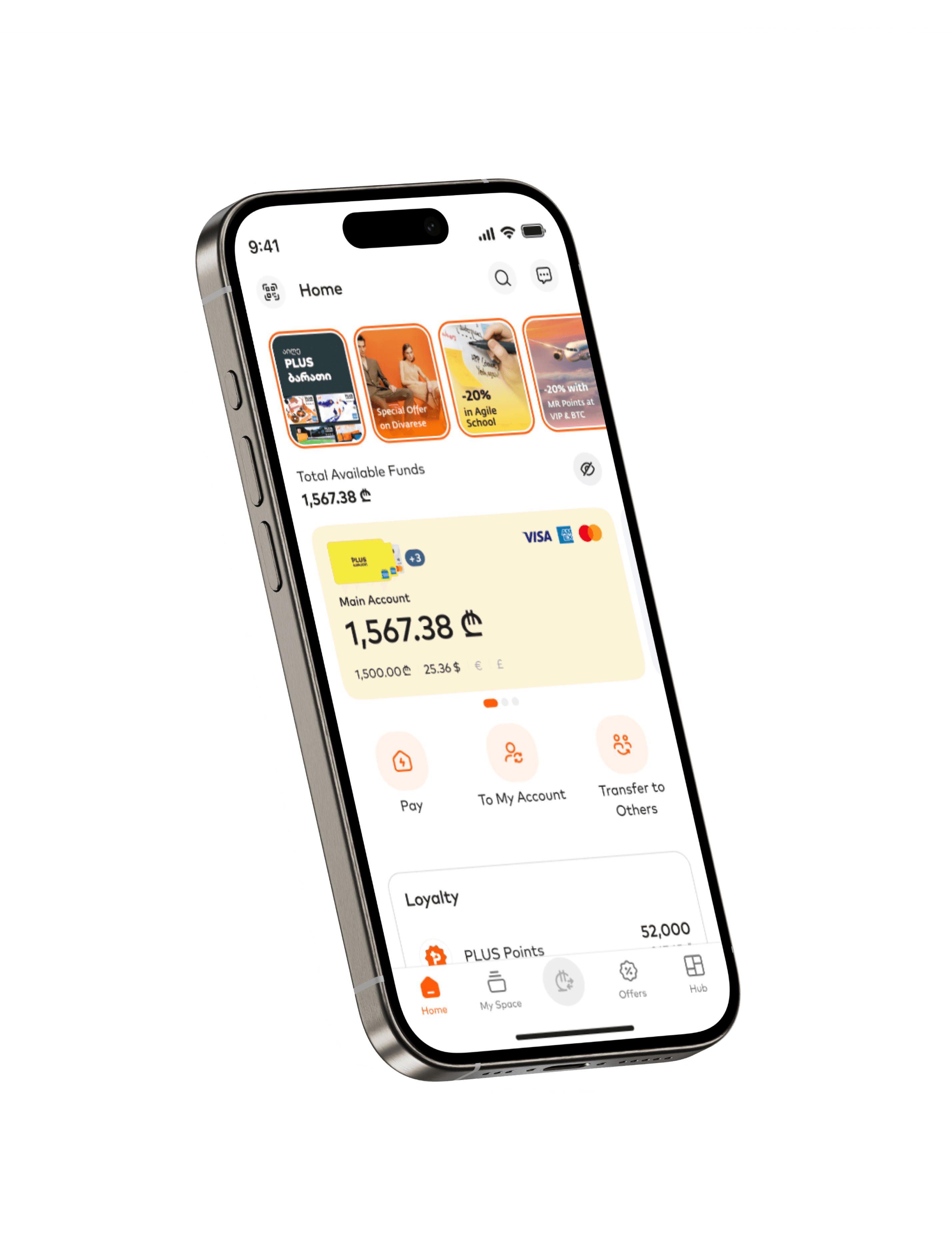
We surface currency details and promoted primary actions to home screen

Design Decision
Currency breakdown on account cards
We transformed account cards from simple balance displays into complete financial visibility.

Design Decision
Primary actions promoted to home screen
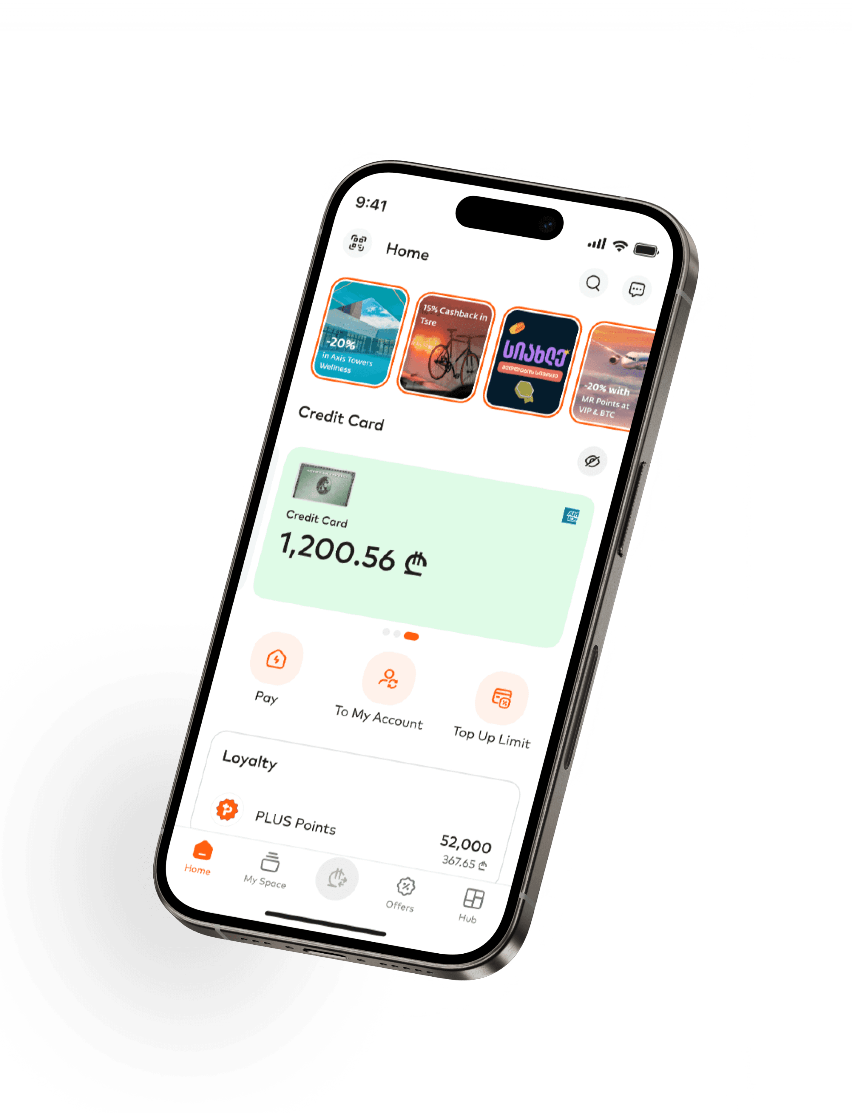
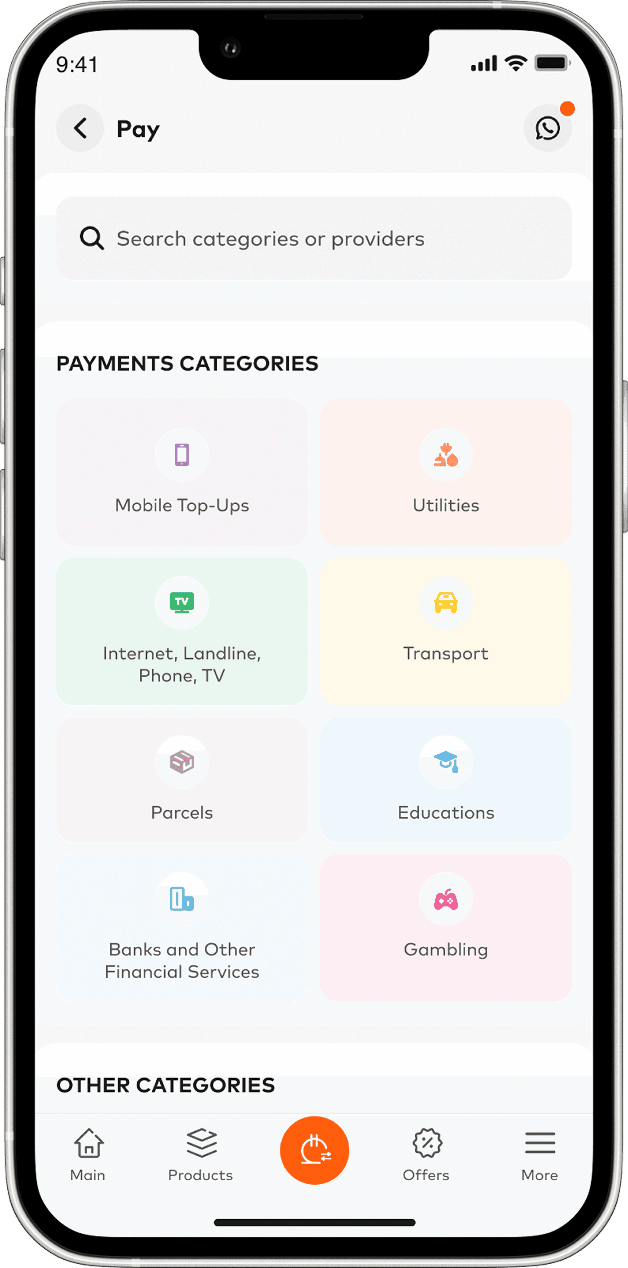
Based on our competitive analysis and usage data, we promoted the three most-used banking functions directly to the home screen:
Pay — bill and service payments
Transfer to Own — Move money between personal accounts
Transfer to Other — Send money to other people
These buttons replaced the previous buried navigation pattern, reducing the action path from 2+ taps to a single tap. We positioned them prominently below the account cards, following patterns established by successful fintech apps.
Before Redesign
Home → ₾ Page → Transfer (1+ taps)
To send money to someone or move funds between accounts, users had to leave the home screen and dig through the Payments page to find the Transfer button.

Home → ₾ Page → Pay (2+ taps)
To pay a utility, users had to navigate to the Payments page, find the Pay button, and then choose the action — 3 steps for one of the most common tasks in the app.
After Redesign


Home → Tap action button (1 tap)
On home page user sees 3 actionable items – Pay, To My Account and Transfer to Others.
Taps the neccesary button and performs transaction.
Impact
Zero taps to see currency breakdown, one tap to transfer
Users previously needed 2-3 taps to see currency balances and 2+ taps to start a transfer. We redesigned the home screen to show all currencies at a glance and placed Pay and Transfer buttons front and center.
Outcome
The new home screen got users to the right actions faster — and made them want to explore more, not less.
Impact
95% of users rated the homepage design positively
Out of 800+ surveyed user throughout 3 months 52% "like it" + 43% "really like it", demonstrating strong approval of visual presentation and information display
67% user use Payment/transfer buttons on home page
Indicating that surfacing primary actions transformed the home screen into an active engagement point rather than a passive overview

Recognition
Global Finance: World's Best Digital Bank (2024, 2025)
Our team’s redesign of home page became part of the ongoing evolution of Bank of Georgia’s mobile experience — a journey that earned Global Finance’s World’s Best Digital Bank award in 2024 and again in 2025.
That recognition came from a field of 167 contenders, including major names like Citi, Santander, and DBS.
Working at scale changes how you design

Redesigning the BOG home screen was not a small task.
1.5 million active users. Customer research, competitive analysis, stakeholder workshops, careful negotiations. Everyone knew that getting it wrong would disrupt millions of people's daily banking routines.
When you're deep in UI components and individual design decisions, it's easy to forget that scale. But it stays in the back of your mind. Every layout choice, every label, every tap — it all carries more weight when you know who's on the other side.
That responsibility makes you more careful. You question things more. You test more. You stop thinking about what looks good in a prototype and start thinking about what works when someone is rushing to pay a bill at the supermarket, checking their balance at the airport, or sending money on a crowded metro.
Months after launch, I still catch the redesigned home screen on strangers' phones — in queues, on public transport, at cafes. That never gets old.
Seeing something you built become part of someone's everyday routine is a quiet reminder of why this work matters. Good UX doesn't just improve metrics. It makes daily life a little smoother for real people.
